Effective Output
Clickable Element Links
work in progress
Progress bars
work in progress
Standard Forms
work in progress
Graphs
Step 1: Create a chart object for the chart type that you want. We’ll add data to this later…
from pyrevit import script

output = script.get_output()

# Line chart
chart = output.make_line_chart()
# Bar chart
chart = output.make_bar_chart()
# Bubble chart
chart = output.make_bubble_chart()
# Radar chart
chart = output.make_radar_chart()
# Polar chart
chart = output.make_polar_chart()
# Pie chart
chart = output.make_pie_chart()
# Doughnut chart
chart = output.make_doughnut_chart()
Step 1-a: Optional: Setup the chart title, and other options. the full list
of options for every chart is available on Charts.js Documentation page.
Some of the properties have their own sub-properties, for example the title option
for the charts has multiple sub-properties as shown below. The value for these
type of properties should be a dictionary of the sub-properties you’d like to set.
All this is explained clearly in the Charts.js Documentation
chart.set_style('height:150px')

chart.options.title = {'display': True,
                       'text':'Chart Title',
                       'fontSize': 18,
                       'fontColor': '#000',
                       'fontStyle': 'bold'}
Step 2: Now let’s add data to the chart. Every chart object has a data property chart.data
that we can interact with to add datasets to the chart. Different types of charts
need different types of data sets in terms of how data is organized, so the chart
can present multiple data sets correctly. I’m providing two examples here, one for
a simple line chart (showing 3 different data sets) and another for a radial chart
(also showing 3 different data sets within the same chart).
They’re all very similar to each other though.
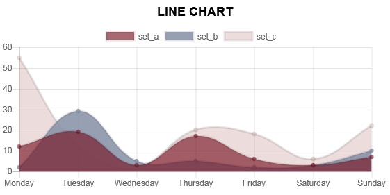
Line charts
See the comments in the script for more info
# this is a list of labels for the X axis of the line graph
chart.data.labels = ['Monday', 'Tuesday',
                     'Wednesday', 'Thursday',
                     'Friday', 'Saturday', 'Sunday']

# Let's add the first dataset to the chart object
# we'll give it a name: set_a
set_a = chart.data.new_dataset('set_a')
# And let's add data to it.
# These are the data for the Y axis of the graph
# The data length should match the length of data for the X axis
set_a.data = [12, 19, 3, 17, 6, 3, 7]
# Set the color for this graph
set_a.set_color(0xFF, 0x8C, 0x8D, 0.8)
# You can also set custom options for this graph
# See the Charts.js documentation for all the options
set_b.fill = False

# Same as above for a new data set: set_b
set_b = chart.data.new_dataset('set_b')
# Obviously a different set of data and a different color
set_b.data = [2, 29, 5, 5, 2, 3, 10]
set_b.set_color(0xFF, 0xCE, 0x56, 0.8)

# Same as above for a new data set: set_c
set_c = chart.data.new_dataset('set_c')
# Obviously a different set of data and a different colorset_c.data = [55, 12, 2, 20, 18, 6, 22]
set_c.set_color(0x36, 0xA2, 0xEB, 0.8)
And here is the result:
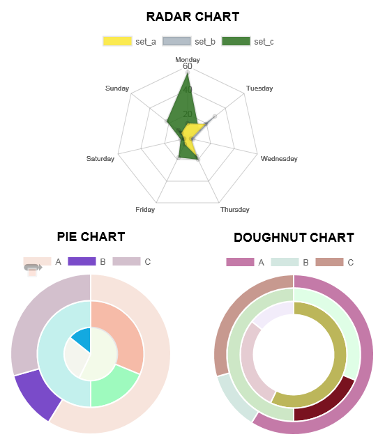
Pie charts
See the comments in the script for more info
# Set the labels for the circumference axis
chart.data.labels = ['A', 'B', 'C']

# Create new data sets
set_a = chart.data.new_dataset('set_a')
set_a.data = [100, 20, 50]
# You can set a different color for each pie of the chart
set_a.backgroundColor = ["#560764", "#1F6CB0", "#F98B60"]

set_b = chart.data.new_dataset('set_b')
set_b.data = [50, 30, 80]
set_b.backgroundColor = ["#913175", "#70A3C4", "#FFC057"]

set_c = chart.data.new_dataset('set_c')
set_c.data = [40, 20, 10]
set_c.backgroundColor = ["#DD5B82", "#E7E8F5", "#FFE084"]
Other charts
You can apply these data sets for radar, pie, polar, and doughnut (since they’re all radial) charts and get different results:
Step 3: The last step is to ask the chart object to draw itself.
# Before drawing the chart you can randomize the colors
# if you have not added any color to the datasets.
chart.randomize_colors()

# Finally let's draw the chart
chart.draw()
Charts engine
Here is a little info on how the charts engine work:
the pyRevit charts module is pyrevit.coreutils.charts.
This is the module that the output window interacts with to create the charts.
The charts module provides the chart object and handles the creation of datasets.
The first thing it does when drawing the graph is to create a html <canvas>
element and assign a unique id to it:
<canvas id="chart123456"></canvas>
Then it parses the input data and create a JSON representation of the data.
The JSON string (json_data) will be inserted into a template javascript.
This javascript is in turn, creating a Chart object from the Chart.js library:
var ctx = document.getElementById('{}').getContext('2d');
var chart = new Chart(ctx, json_data);
and finally, the pyRevit chart object, injects this dynamically created javascript into the <head> of the output window WebBrowser component:
output.inject_script(js_code)